I’ll get straight to the point: how good is that NHS blood donation campaign?
(if you’re not aware of it, the campaign highlights the ‘missing blood types’ through the removal of the letters a, o, and b from … well, just about anywhere)
Like all good ideas, it’s a simple solution to a problem that loads of people/agencies have looked at (and no doubt they came up with all sorts of complex ideas), but no-one had the clarity, until now, to think: ‘hang on, the blood types are A, O, B… how about a guerrilla campaign that takes those letters out of things… gets people talking… then raises huge awareness of blood donation and the blood types’?
It started with the removal of the letter ‘o’ from the Downing Street sign:

This got people talking; ‘why is the O missing from Downing Street?’
So, already there was hype around the campaign before it became clear what it was about.
Next thing I know, other brands are getting involved and I see this tweet, from London Pride:
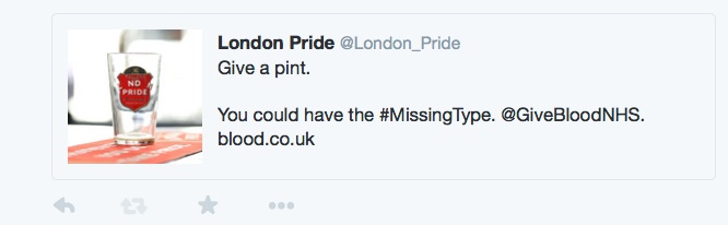
Not only have London Pride joined in by removing the o’s from their name, the message ‘give a pint’ is also spot on for both the campaign and themselves, as a beer: seamless.
I then realised that loads of brands were getting involved; another way in which the campaign is incredibly smart.
Other big brands will take a/o/b out of their name, for free, as it makes them look good by being involved: effectively, they’re doing pro bono charity work.
This then spreads the message, at no extra cost – in terms of media spend – to the NHS.
I have a feeling that some brands were persuaded to take part, but now it’s snowballed and other brands are getting involved, regardless.
I even noticed that the Metro ‘Good Deed Feed’ was pushing the campaign to the fore:
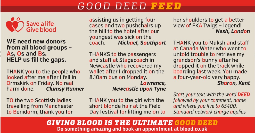
They haven’t just highlighted the a’s / o’s / b’s in red, they’ve also finished with the neat line; ‘Giving blood is the ultimate good deed’.
Slick.
The whole campaign is fantastic as it’s so simple and so noticeable. Words are unavoidable – despite the fact that we’re supposedly living in a visual world: they’re on every website, every leaflet, every TV channel etc.
And how commonly are the letters o, a, b used? I must’ve used those letters 200 times in this post alone.
The campaign could work anywhere, across any media channel. It’s truly media neutral.
And it’s not just ‘clever’, it actually gets the message across: ‘we’re missing blood / blood types, so get involved’ (none of the mercenary ‘ you might need blood one day’ stuff).
It’s been a long time since I’ve seen a campaign as simple, smart (both strategically and creatively), relevant, seamless, truly integrated, and as well thought through.
It’s borderline genius, and I wish, wish, wish it was in my portfolio – dammit!
I don’t know the exact creative team behind it, but I know the agency is Engine.
Engine: I salute you – a phenomenal campaign. I hope this absolutely cleans up in terms of awards. It deserves to.